CLIMATE CHANGE WORKSHOP SERIES
CLIMATE CHANGE WORKSHOP SERIES
CLIMATE CHANGE WORKSHOP SERIES
The Coalition of Black Trade Unionists (CBTU) was running a climate justice workshop series for Black communities in the Greater Toronto Area. My role was to support the visual side of their social media campaign so the invitation into that conversation felt warm, clear, and meant for them.
The Coalition of Black Trade Unionists (CBTU) was running a climate justice workshop series for Black communities in the Greater Toronto Area. My role was to support the visual side of their social media campaign so the invitation into that conversation felt warm, clear, and meant for them.
The Coalition of Black Trade Unionists (CBTU) was running a climate justice workshop series for Black communities in the Greater Toronto Area. My role was to support the visual side of their social media campaign so the invitation into that conversation felt warm, clear, and meant for them.

STARTING WITH UNDERSTANDING
STARTING WITH UNDERSTANDING
STARTING WITH UNDERSTANDING
I was brought in to create visual assets for the campaign: social tiles and graphics promoting three climate workshops. The goal was not to impress anyone with design, but to make people feel seen around the issues they already cared about.
I took the themes we were already working with and turned them into graphics that felt like a genuine “come through” to the people CBTU most wanted in the room. I focused on making each asset feel like it was talking with people, not at them.


DESIGNING VISUALS THAT FELT FAMILIAR
On the legislative front, the campaign vigorously pursued the alignment of Canadian laws with the United Nations Declaration on the Rights of Indigenous Peoples (UNDRIP). After overcoming resistance, the effort bore fruit with the introduction of Bill C-15 in 2020, marking a significant stride towards embedding these principles into Canadian law. During the Mi’kmaq Fishery dispute, the Canadian Labour Congress stood firm against injustice, advocating for the protection of treaty rights amidst challenging circumstances.


DESIGNING VISUALS THAT FELT FAMILIAR
DESIGNING VISUALS THAT FELT FAMILIAR
From the start, we agreed the visuals should feel close to everyday life, not like generic “climate crisis” posters.
So instead of distant glaciers or dramatic disaster shots, the layouts leaned toward what people in the GTA actually live with: heat, flooding, housing pressure, the cost of food, long commutes, care work. The imagery and compositions were a quiet nod to Black workers, families, and neighbourhoods that don’t usually see themselves centered in climate conversations.
I kept the design language simple and clear. Strong, readable type. Clean shapes. Enough colour and contrast to feel alive, but not so much that the message got lost. Every choice was there to support a single idea: this is about you and your people; you belong in this conversation.


On the legislative front, the campaign vigorously pursued the alignment of Canadian laws with the United Nations Declaration on the Rights of Indigenous Peoples (UNDRIP). After overcoming resistance, the effort bore fruit with the introduction of Bill C-15 in 2020, marking a significant stride towards embedding these principles into Canadian law. During the Mi’kmaq Fishery dispute, the Canadian Labour Congress stood firm against injustice, advocating for the protection of treaty rights amidst challenging circumstances.
DESIGNING VISUALS THAT FELT FAMILIAR
DESIGNING VISUALS THAT FELT FAMILIAR
From the start, we agreed the visuals should feel close to everyday life, not like generic “climate crisis” posters.
So instead of distant glaciers or dramatic disaster shots, the layouts leaned toward what people in the GTA actually live with: heat, flooding, housing pressure, the cost of food, long commutes, care work. The imagery and compositions were a quiet nod to Black workers, families, and neighbourhoods that don’t usually see themselves centered in climate conversations.
I kept the design language simple and clear. Strong, readable type. Clean shapes. Enough colour and contrast to feel alive, but not so much that the message got lost. Every choice was there to support a single idea: this is about you and your people; you belong in this conversation.
WHAT HAPPENED
WHAT HAPPENED
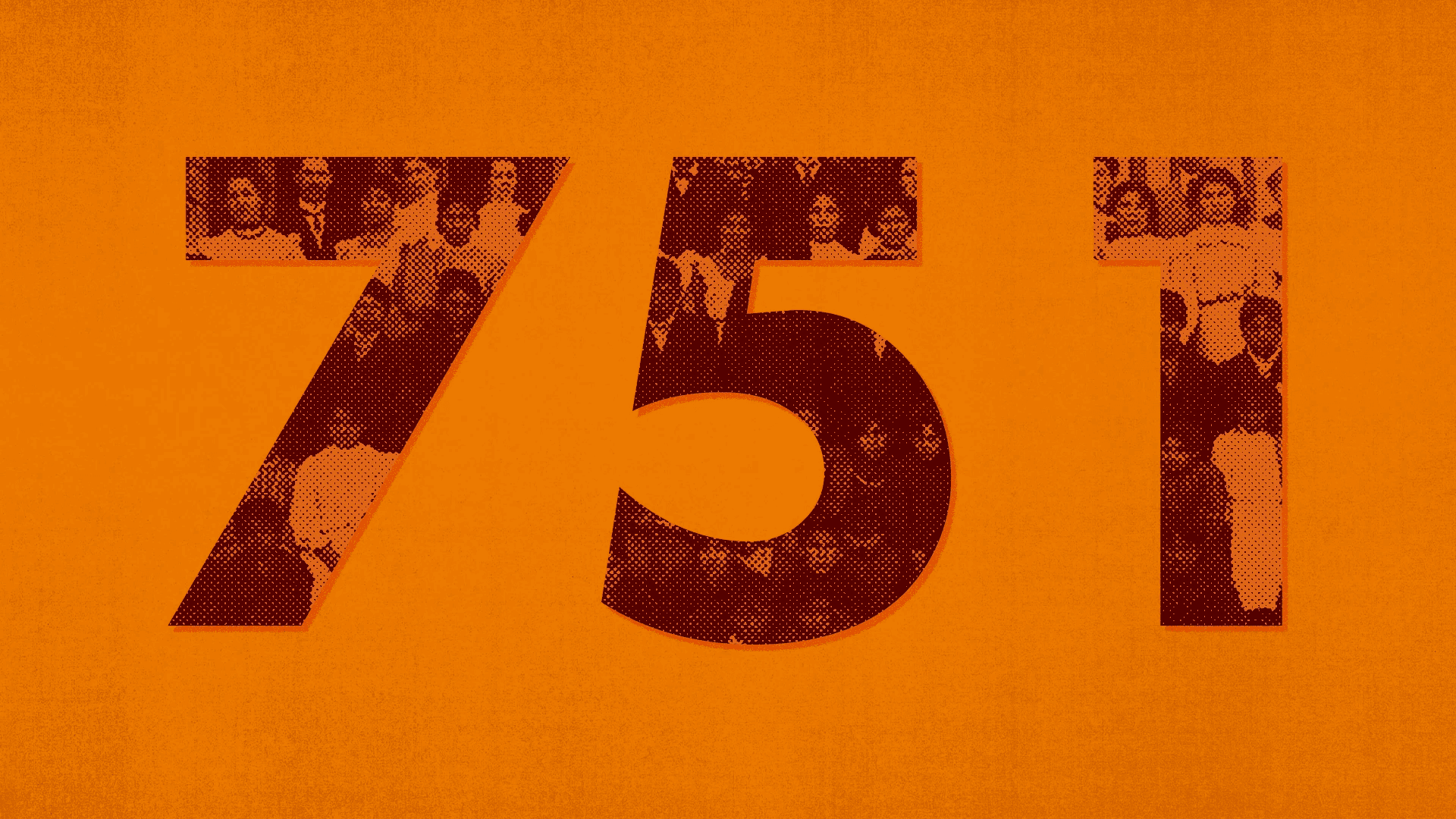
Across the three workshops, we filled about 95% of available seats. CBTU brought the organising, relationships, and trust while I made sure the invitations were as clear and specific as possible so Black workers and families could see themselves in it and choose to show up.
I also drafted short captions for each visual – social posts, LinkedIn blurbs, simple plug-and-play lines – to make it easier for the team to share the work and keep the message consistent across platforms.

From the start, we agreed the visuals should feel close to everyday life, not like generic “climate crisis” posters.
So instead of distant glaciers or dramatic disaster shots, the layouts leaned toward what people in the GTA actually live with: heat, flooding, housing pressure, the cost of food, long commutes, care work. The imagery and compositions were a quiet nod to Black workers, families, and neighbourhoods that don’t usually see themselves centered in climate conversations.
I kept the design language simple and clear. Strong, readable type. Clean shapes. Enough colour and contrast to feel alive, but not so much that the message got lost. Every choice was there to support a single idea: this is about you and your people; you belong in this conversation.
DESIGNING VISUALS THAT FELT FAMILIAR
GRATITUDE
I’m grateful to work with the CBTU team on this. Work like this matters to me because it reminds people that these are not someone else’s conversations; they are ours, too. We do not have to wait to be invited to the table. We can sit down, listen, and speak up, believing our contribution matters more than we think.


GRATITUDE
GRATITUDE
I’m grateful to work with the CBTU team on this. Work like this matters to me because it reminds people that these are not someone else’s conversations; they are ours, too. We do not have to wait to be invited to the table. We can sit down, listen, and speak up, believing our contribution matters more than we think.
I’m grateful to work with the CBTU team on this. Work like this matters to me because it reminds people that these are not someone else’s conversations; they are ours, too. We do not have to wait to be invited to the table. We can sit down, listen, and speak up, believing our contribution matters more than we think.
I was brought in to create visual assets for the campaign: social tiles and graphics promoting three climate workshops. The goal was not to impress anyone with design, but to make people feel seen around the issues they already cared about.
I took the themes we were already working with and turned them into graphics that felt like a genuine “come through” to the people CBTU most wanted in the room. I focused on making each asset feel like it was talking with people, not at them.
STARTING WITH UNDERSTANDING
GRATITUDE
I’m grateful to work with the CBTU team on this. Work like this matters to me because it reminds people that these are not someone else’s conversations; they are ours, too. We do not have to wait to be invited to the table. We can sit down, listen, and speak up, believing our contribution matters more than we think.
Interested in working together?
Interested in working together?
Interested in working together?